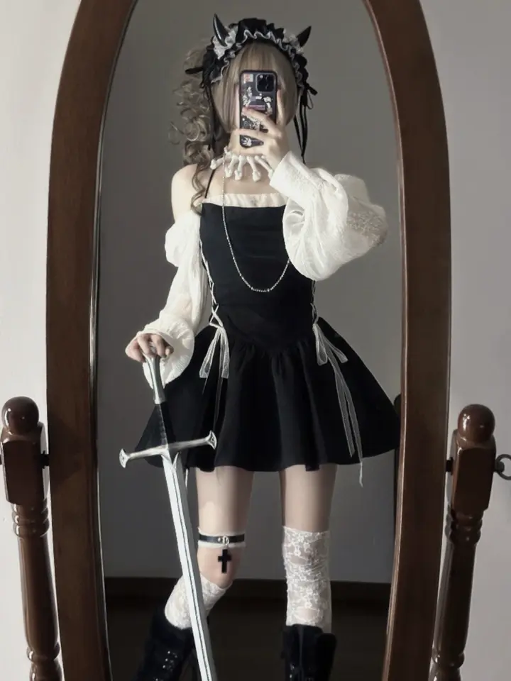
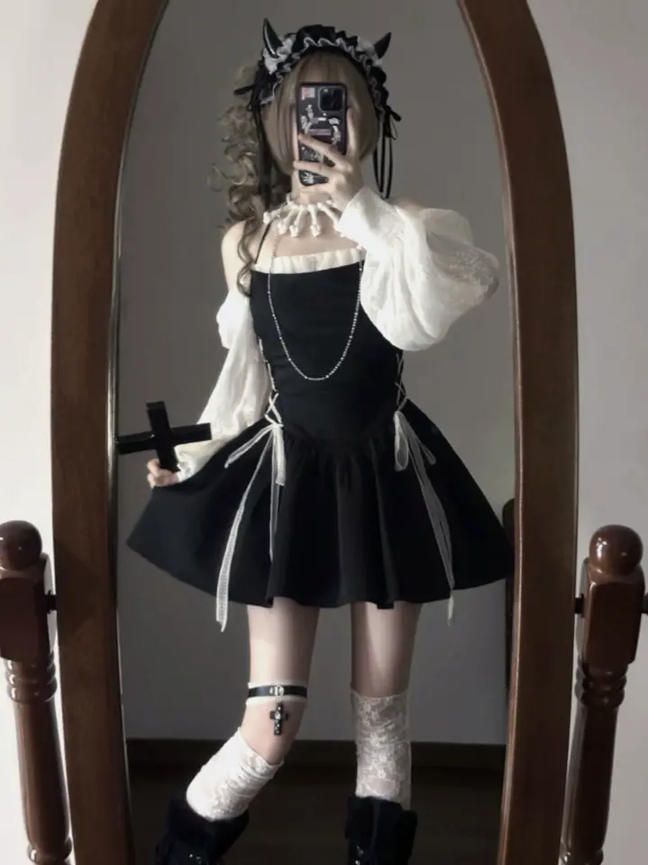
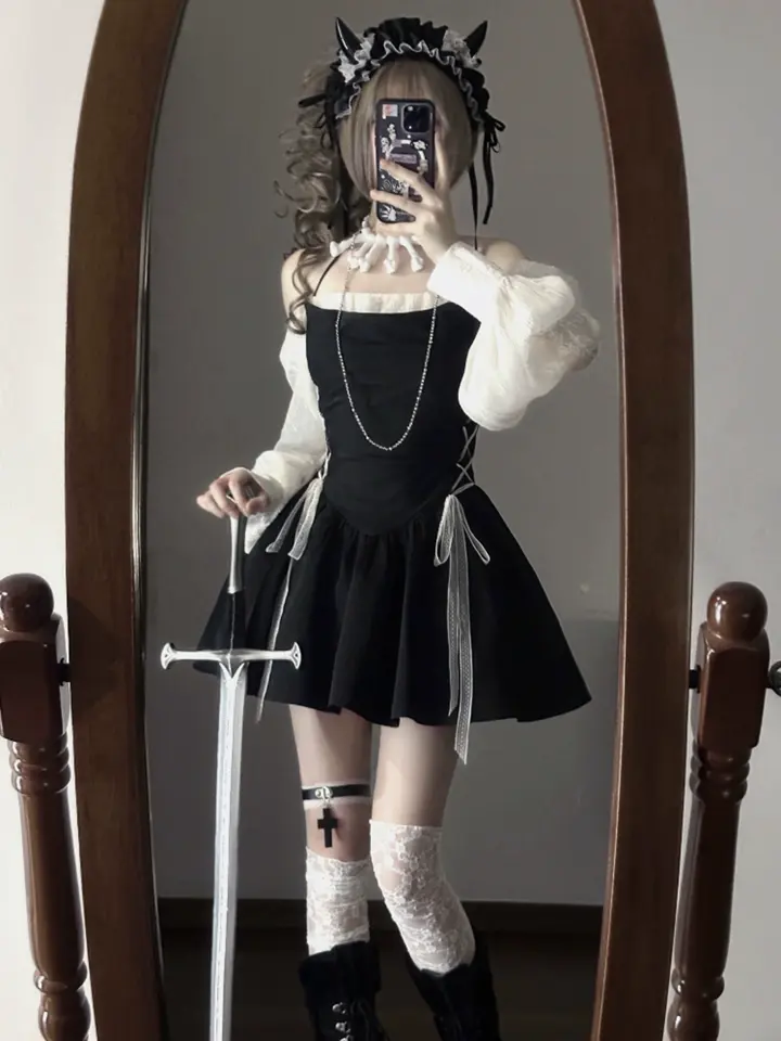
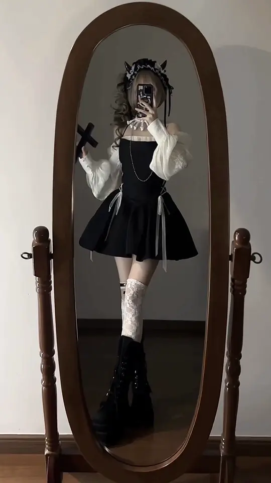
The Pearl Tear bag has a face on it, and the face is weeping pearls. Not printed pearls, either: PutOut adds pearl-like detailing over the full-surface artwork, so the ornament sits on top of the ink. Hold it against a plain gray sweatshirt and the sweatshirt stops existing. That is the whole proposition of this label in one object. The bag is the outfit's loudest line, and everything else is there to let it talk.
PutOut's range is small and unusually single-minded. Of the fourteen pieces we carry, eleven are bags, and nine of those are oversized totes cut from DuPont paper and printed edge to edge with the brand's own artwork. The other three are fitted tees with the same subcultural attitude, each carrying its own graphic. There is no quiet basics line hiding behind the statement pieces. Every piece is the statement.
Paper that behaves like a carryall
"Paper" undersells it. The totes are made from DuPont paper, the Tyvek HYPAKT material the brand describes as lightweight yet durable, with water-resistant, tear-resistant and fold-resistant properties; the pink carryall adds flexible and washable to that list. The lightness is what makes the oversized footprint livable. The Thousand-Mile Pony carryall measures 50 by 32 by 15 and comes with a non-removable strap designed for both shoulder and hand carrying. Because the surface takes high-quality ink across its entire face, the artwork reads as a drawing rather than a logo placement, and the bag reads as a canvas that happens to hold your laptop.
The artwork is the point
Every graphic here is PutOut's own. The Pearl Tear face. The Candy Girl, a face with expressive eyes, stars, a bandage and lollipop motifs, offered in three pattern options. The Thousand-Mile Pony. The I Don't Care tote. A "spicy girl" drawn from Y3K Shibuya street culture. An original leopard-face graphic on one oversized tote, and a second leopard version finished with a front brand logo patch. Then there is the "Don't Cry" tote, the one oversized bag made in distressed PU rather than paper, its surface worn in to match the mood. These are not borrowed references. They are characters the brand drew, and two of the bags carry a front authenticity or anti-counterfeit label to say exactly that.
The Pearl Tear is the one I would start with, because it is the only piece where the artwork leaves the flat plane: the pearl detailing gives the face an ornamental finish you can feel as well as see. If you want options instead, the Candy Girl tote is the pick; its three pattern variations let you choose how much of the face you want showing. Either way, buy for the wardrobe you own, not the one you wish you owned. A crying face against black and denim is already a lot.

How to dress around a bag this loud
Rule one: plain clothes. A printed tote this size covers a third of your torso when it hangs from the shoulder, so it is already doing the work of a printed top. Give it a solid tee, a solid knit, straight or wide-leg pants in black, gray or washed denim, and let the bag be the only accent you choose on purpose. The Y3K tote is the test case. Its spicy-girl graphic is printed in full-surface oil ink and finished with front seam stitching and the brand's anti-counterfeit label, more detail than most outfits can absorb. Keep everything around it quiet and it looks deliberate. Add a second print and it looks like an accident.

Rule two: one graphic. This matters most if you also buy the tees, because the tees are not neutral. The Ribbed Graphic Fitted T-Shirt is cut close in a stretch cotton-spandex rib, the kind of fitted short-sleeve shape that works under an open shirt or alone with high-waisted trousers, and it carries the same subcultural attitude as the bags. Its siblings go further: one is a red cotton tee with a heart-and-eye graphic framed by stars, the other a slim stretch tee with an all-over print that reads as distressed. Wear any of them with a printed-face tote and you have two characters arguing across your body. Wear them with the distressed PU "Don't Cry" tote instead, whose texture reads as finish rather than picture, or with a leopard tote, whose spots behave more like pattern than portrait, and the tee gets to be the picture. One drawing per outfit. The rest is surface.

When oversized is too much
Not every day wants a 50-centimeter bag. For those, PutOut makes one compact piece: a structured PU crossbody carrying the candy-girl face with star details at a scale that sits against the hip instead of swallowing it. Same drawing, same attitude, a fraction of the volume, and it is the piece to reach for when the outfit already has something going on, a sequined skirt, say, or a sheer top. The character stays. The shouting stops.
What I like about this label is that it refuses the hedge. Most bag brands make the loud one and then make six safe ones to pay for it. PutOut makes the loud one eleven ways and trusts you to own a plain sweater. If that sounds like your week, the newest pieces land in New Arrivals first.